After my pathetic showing in the February salon a week earlier (the February salon was delayed by a snowstorm), I wasn’t really looking forward to the March salon.
Print Competition: Color
I was really pleased with both of my color print entries, but nervous about them since one of the images I thought was a slam-dunk for the January salon didn’t do well at all for reasons I still don’t understand. There is just no telling what a judge will be looking for.
I’d printed my Wac-a-Mole image earlier in the year on matte paper and was pretty happy with it, except that the matting cut off the top of the flags. Five printings later (Lane told me I was crazy) I had a tooling line just the right width to preserve the full image when matted and a metallic paper that made the image glow in a way that I felt transported the viewer right to the fair.
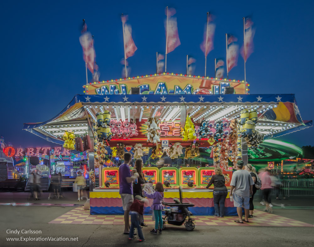
The judge agreed, awarding me a 10!
My second print was another one that I had printed earlier, but tweaked and reprinted on a rich glossy paper that made the water look as if you could step right into it.
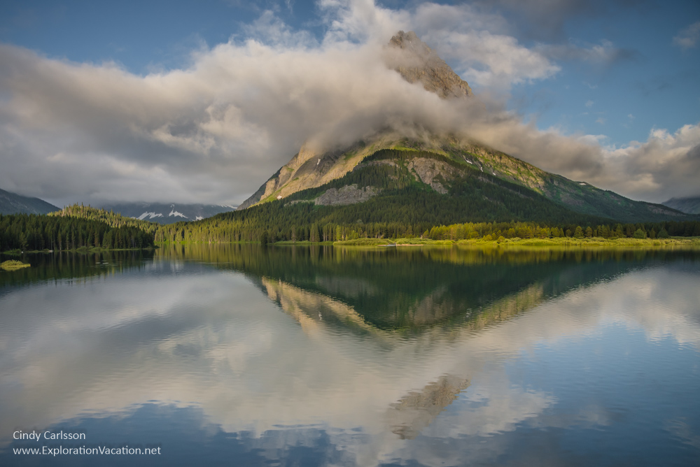
The judge liked this one too, giving me another 10!
(I guess it really was worth getting up for sunrise at Glacier.)
Digital competition: Street photography
I was pretty nervous about the street photography competition. I’d spent a couple of months going back and forth over what I was going to enter, going so far as to spend hours on an image that I later rejected as not well enough focused. In the end I had to choose between submitting images that were raw and gritty street scenes or fine art images of people doing interesting things in public places.
I chose the fine art direction and then was sure once I got to the meeting that I had made the wrong decision.
I hadn’t. The judge does a lot of street photography, but with a fine art bent, so my images were a good match.
My first image was taken in Orvieto Italy.
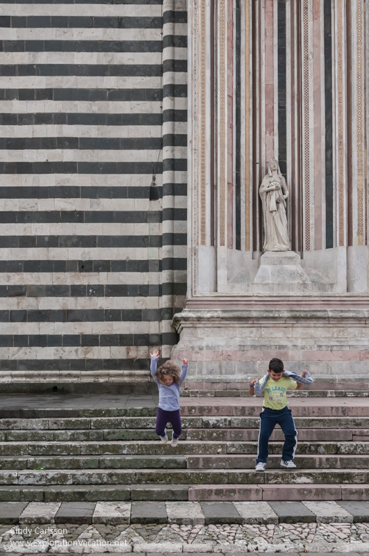
The question here was how close to crop it. I had two different versions – the one above and one that was cropped right at the top of the angel. Lane thought I should crop it even farther (making it a horizontal), but I felt that it wasn’t really street photography unless there was more context. It needed the angel. In the end I chose the crop I did because I liked how insignificant the leaping children looked below the angel and all those lines.
Unfortunately, the judge would have preferred my slightly closer crop (he actually showed a version cropped almost identically to the one I didn’t submit). Still he gave me a 9.
The second image wasn’t quite a last-minute decision, but close.
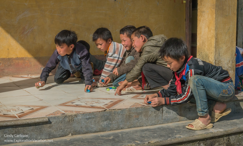
I love the story this picture tells – Vietnamese school boys engaged in their game – and how the light perfectly lights all of their faces. But I struggled with the cropping on this one too. I knew I wanted to eliminate as many distracting element as I could, but I was hesitant to crop into the rear end of the boy in front in order to totally eliminate the glimpse of the boy on the other side of the pillar. That turned out to be a mistake, as it is exactly why the judge gave me a 9 instead of a 10! Still, it’s hard to complain about getting a 9.
As you can guess, I was a LOT happier at the end of this salon than the last one!